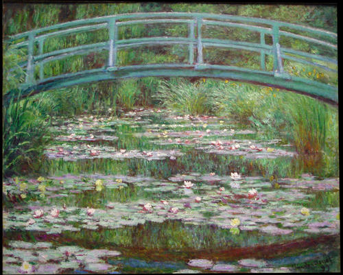
 Claude Monet, The Japanese Footbridge, 1899, National Gallery of Art, Washington D.C.
Green means GO! Beginnings are Green. Green means to grow! Fresh and peaceful; compostable and environmentally friendly. Green sounds like cicadas and fresh lettuce.
Green is a secondary color made from mixing Yellow and Blue. It is complimentary with Red. Green is Muhammad’s favorite color and symbolizes serenity and calm. Paradise. Green smells like lime and mint mojitos. Green feels like smoking and sitting in grass. Grand views of rolling hills. A popular color to wear during pregnancy, It represents renewal, regeneration, and rebirth. Green is youthful. A Greenhorn is inexperienced. A Greenroom is a space to rest. Green is recyclable. Green can be heroic. In his infamous Green cloak, Robin Hood liberates hoards of money from Green-eyed, greedy Grinches.
Green is untrustworthy. In China, a Green hat signifies infidelity; It is unlucky to wear it on the stage and unlucky to drive on the racetrack. A Green witch terrorizes Emerald City. Noxious and humid, Green is acidic mountain dew, Nickelodeon slime, and toxic waste. Nothing is less appetizing than Green eggs and ham. (Maybe Green beans.) Sick, nauseous, it tastes like bitter celery and salty seaweed. Green is the most dangerous pigment in the world. It’s historically fussy and notoriously hazardous to work with.
History:
Green was one of the first pigments attempted by early artists; plant pigment, chlorophyll, fades with time. Ancient Egyptians made it by combining crushed malachite and copper minerals which would eventually oxidize into Black. Ancient Romans would throw a copper plate into a vat of wine which produced a beautiful blue-green. It was unstable, it could not resist dampness, it did not mix well with other colors, and it was toxic. Leonardo da Vinci, in his treatise on painting, warned artists not to use it.
In 1775, Carl Willhelm Scheele made a truly stunning, vibrant Green pigment. The ‘it’ color of the Victorian era, Scheele’s Green became so fashionable that it was seen everywhere from make-up, clothing, toys, and, famously, Napoleon Bonaparte’s bedroom wallpaper. I subscribe to the popular theory that this wallpaper was the cause of his death because this pigment was made from arsenine (a known poison).
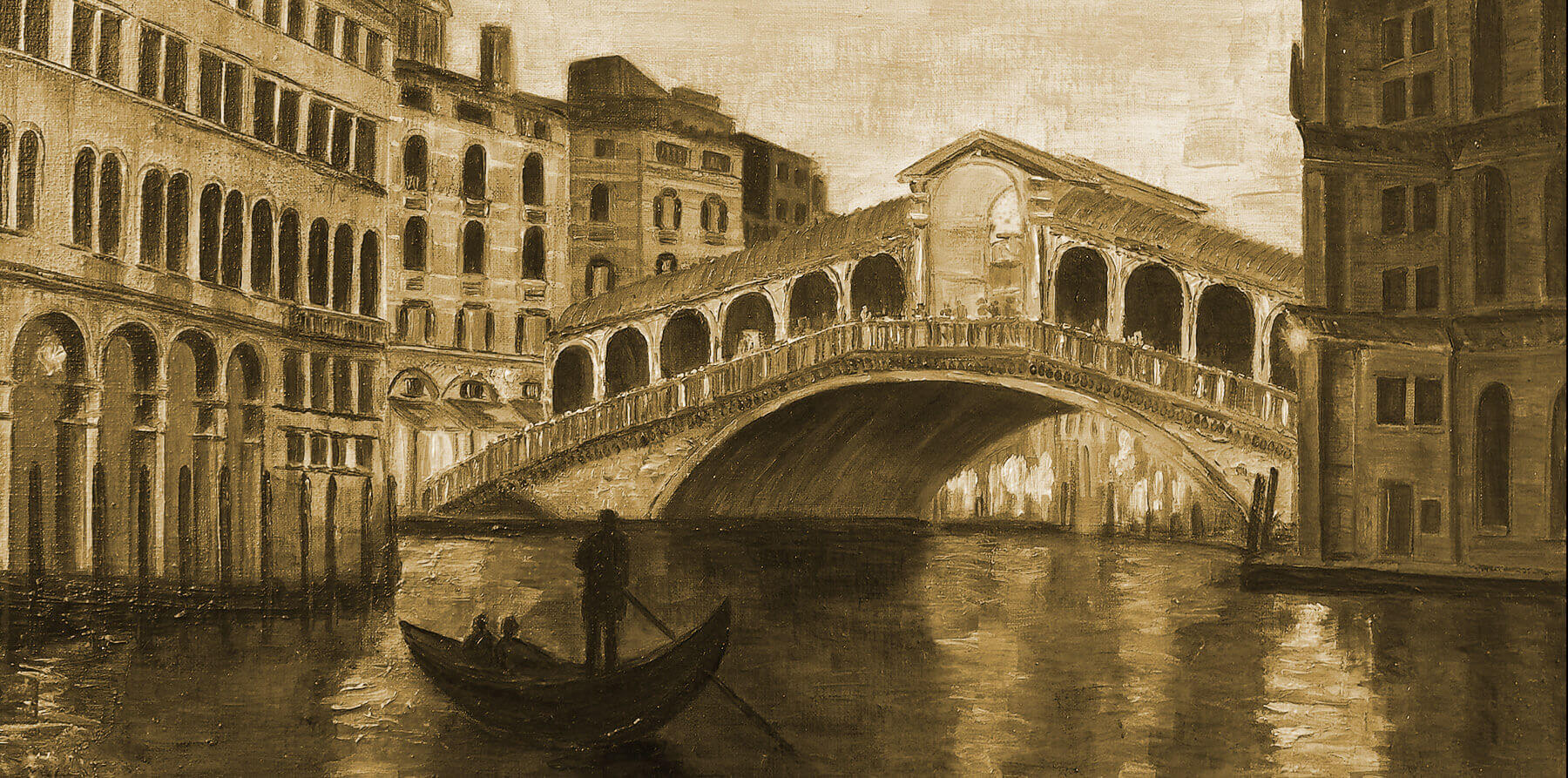
That deadly pigment was replaced with an equally deadly pigment made with a mixture of arsenic and copper. Paris Green was named for the Parision Impressionists who were deeply inspired by nature and mostly painted en plein air (outside). Paris Green was most likely the culprit behind Paul Cezanne’s diabetes, and Claude Monet’s blindness. In his painting The Japanese Footbridge, Monet uses this poisonous Green together with the symbol of a bridge to revive hope for a peaceful future. Green represents a fascinating aspect of human nature: many are willing to die for beauty in art.
In Kassia St. Clair’s The Secret Lives of Color, she references a Buddhist fable about Green. In the story a deity visits a boy in a dream. The deity tells him that in order to obtain everything he’s ever wanted he only has to close his eyes and not picture Sea Green. There are two possible outcomes to this tale: either the boy succeeds and finds enlightenment or the boy is consumed by failure until his life and sanity fade away.
Outcome #1: Enlightenment
Don’t picture Sea Green.
I’m not delusional enough to claim that I know the secret to enlightenment. However, I can say with certainty that, If I were the boy from this tale, my enlightenment would be guaranteed. Perhaps I found a 4-leaf clover in a past life because, luckily, I have aphantasia (I lack visual memory). I can’t picture any color! But, beyond lacking the ability to ‘see’ with your eyes closed, I have no further advice for achieving enlightenment. Instead I can advise you on how to fail.
Outcome #2: Insanity and Death
Picture Sea Green.
The first issue lies with language. What color is Sea Green exactly? Language has never been quite able to categorize color concretely. (In many languages, such as Japanese, there is no distinction made between Green and Blue). Many have laid claim to the title. Pantone, Crayola, and Copic have all made their opinions known (although I doubt a deity would respect the authority of any company or brand). The truth is that, technically, there are many colors that could be and are referred to as Sea Green.
Another issue is how our eyes and brains understand color. For example, If you were to look at a 4-leaf clover it would appear Green. That’s because some light is hitting the clover and being absorbed, while other light bounces off and hits our eyes. The color that we see is precisely the color the clover is not. Which inevitably leads to the question of whether or not color even exists in reality.
Let’s assume that ‘reality’ doesn’t matter. Then there’s the problem that anyone who has spent any time looking at the sea would know that it oscillates infinitely between innumerable shades. The truth of the matter can be spun a couple ways. One, because of reflections the sea has been every color. Two, the sea is made of water which is technically clear, and therefore it has no color. So Sea Green is both everything and nothing.
Green reminds us that everything dies and that life is ephemeral. Born again, it always returns with the spring. Green is life and therefore essential. Unavoidable yet hard to grasp. It is everywhere in our natural world. It is hope. And although we now have access to a few non-deadly Green pigments, artists rarely use pre-made Green; they prefer to mix it themselves. Ultimately, mixed Greens come the closest to permanence.
Related Works of Art:
- The Arnolfini Portrait by Jan van Eyck
- Lucretia by Paolo Veronese
- Orpheus Leading Eurydice from the Underworld by Jean-Baptiste Camille Corot
- Luncheon on the Grass by Édouard Manet
- Green Wheat Fields, Auvers by Vincent van Gogh
- The Japanese Footbridge by Claude Monet
- Mont Sainte-Victoire with Large Pine by Paul Cézanne
- Blue Green Red by Ellsworth Kelly
- Green Kiss/Red Embrace (Disjunctive) by John Baldessari
- Green Table by Jenny Holzer

Art Instructor, Art School LLC
Comments (2)

I love these color blogs, can't wait for more.
Green is my favorite color, so gorgeous to see it all highlighted here.