
Pastels just might be the most underrated medium in all of art history. You rarely see them on exhibit at all, let alone as the star of the show. So, it’s particularly special that San Francisco’s Legion of Honor has brought these works front and center in their current exhibit “Color into Line: Pastels from the Renaissance to the Present.”
Why Pastels?
There are three things that make pastels so incredibly interesting:
1. The medium itself hasn’t changed significantly in the past 500 years. It’s just pigment, filler, and binder. Therefore, when viewing the work as it changes from exhibit room to room across the centuries, we get the chance to see how the exact same materials are used so uniquely depending on the artist and the era.
2. Pastel is the only medium that lets you draw a line and color the line at the exact same time. As we see throughout the the exhibition, you can vary this considerably depending on the pressure you use, the form of the pastel (a pencil vs. a chalk block, for example), the combination with different materials, etc. The artist’s choices range from very dreamy Impressionist works, to hyperrealistic, almost photographic, contemporary pieces. Regardless, though, the medium lends itself really well to speed, spontaneity, and immediacy. This, along with its portability and affordability, makes pastels unique from other mediums.
3. Both female and male artists have long been recognized for their work with pastels. The first room exhibiting pastel arts in “Color Into Line” features work from women artists dating back five centuries. Women weren’t exactly welcomed as artists at that time; they were banned from the salons and classrooms where men studied. But pastels were considered more of a pastime than a fine art, so women were allowed to indulge. And they ended up, naturally, creating great works of art. There are at least two, and often more, women artists featured in each room of the exhibit.
Who Paints In Pastels?

Wayne Thiebaud, Pastel Scatter, 1972. Pastel. Thiebaud Family Collection. © Wayne Thiebaud/Licensed by VAGA, New York, NY.
There’s something really interesting about this gender thing in pastels, though. On the one hand, women were “allowed” to enjoy pastels, yet pastels weren’t taken as seriously as other art forms. On the other hand, very famous male artists also used pastels. Dating as far back as the medium’s beginning and continuing through each room of the exhibit, you’ll discover names that perhaps you never even associated with pastel art. Did you know that Leonardo da Vinci created a recipe for pastels and even invented a machine for pressing it into sticks, though you won’t find any da Vinci works created in pastel. However, his students did pick up the art form.
One of the women whose works you’ll find in the first room of the exhibit is Rosalba Carriera. At the time, the Academie Royale in Paris did not admit female students. And yet, they made an exception for her, and that exception was based on her pastel art skills.
Throughout the rest of the rooms, some of the famous artists you might not know used pastels include: Salvador Dalí, Edgar Degas, Wayne Thiebaud,Jean-François Millet, Édouard Manet, Richard Diebenkorn, and Diego Rivera. A few of the female standout artists that you don’t want to miss include Berthe Morisot, Mary Cassatt, and Eva Gonzalès. They were not simply outstanding artists but specifically did amazing work with pastels.
Why Are Pastels So Underrated?
Most people don’t think of pastels as deserving of a full exhibition. Why is this? Well, it certainly doesn’t help that it was associated with women's work. We haven’t historically valued women equally to men, and therefore haven’t valued this art as equal to oil paintings and other mediums.
Additionally, the affordability of the medium has made it accessible to such a diverse range of artists. And in the often-snobby art world, this means that people have given the artwork created with pastels less value.
However, it’s not all about society looking down its nose at pastels. A lot of it actually has to do with the fragility of the medium. Pastels simply don’t hold up well over time. They can’t sit under museum lights every single day for years without damage. As a result, we simply rarely see pastels exhibited. With less exposure to them, we aren’t educated in appreciation of them, which is what makes this exhibition so special. The museum worked hard to combine the works in their archives (which make up about two-thirds of the exhibit) with borrowed works to offer us the chance to fully understand and explore the history of the pastel medium. More than that, additional info on signage and via QR codes gives you lots of extra knowledge about pastels as a medium and a technique. If you’re interested in developing your pastel art lexicon, this is the place to do it.
The Rooms of The Exhibit
The rooms of the exhibit are laid out in such a way that we get the chance to truly see the development of pastels across time. The medium hasn’t changed much, but we do see the subtle changes. For example, the first room is filled with portraiture. The kind of old portraiture that you think of when you think of people “sitting for a portrait.” Then, room number 2 is all landscapes. Go back to room number one and you’ll notice that there’s no green in that work. Return to that second room and green flourishes. That’s because in the beginning, no artist could figure out how to create green pigment. Oddly, it’s not a color that exists in nature in a form that works for pastels. But then they figured it out and green abounded and pastels were used to render beautiful green landscapes.
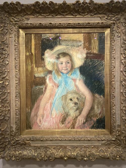
Mary Cassatt. Sara in a Large Flowered Hat Looking Right Holding Her Dog, ca. 1902.
In the third room, we have Impressionism. Many of these works are portraits as well, but of course, there’s a significant stylistic difference between the earlier pieces. Compare, for example, Jean-Etienne Liotard’s 18th-century Portrait of a Man and His Dog with Mary Cassatt’s 19th century Sara in a Large Flowered Hat, Holding Her Dog. Both are of a single person with a dog, but Liotard is all lines; the texture of his clothing is exquisitely done thanks to detailed precision with the pastels. Both man and dog sit, posed for a formal painting. Sara, on the other hand, squeezes her little dog with joy, as if unaware that she’s the subject of a painting. Cassatt’s hand appears to move quickly, giving us the impression of the scene without defined lines. It’s a testament to the changing style of art over the decades, as well as to the way that pastels can be used uniquely depending on the hands that hold them.
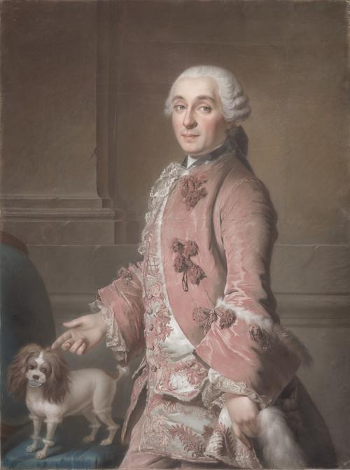
Jean-Étienne Liotard. Portrait of a Man and His Dog, possibly Philippe Basset de la Marelle (1709-1779), ca. 1746–1750.
Fun Fact: This piece by Liotard is on display in this exhibit for the first time ever since its creation hundreds of years ago.
The other rooms bring us up to the 20th and 21st centuries. We get the chance to see that some artists used pastels in sketches for eventual works done in other mediums, whereas other artists made large-scale art directly in pastels. Most of the pastels are done on paper or canvas, but where it gets interesting is when we look at the way in which artists mixed pastels with different mediums. Pay attention and you’ll see pastel combined with graphite, charcoal, and chalk as well as with watercolor and oil.
5 Pieces Not To Miss
Hopefully, you’ll have the opportunity to wander leisurely through the entire exhibit. Look at the sides of the paintings where the artists sometimes tested colors before applying them; you’ll see this in Diebenkorn’s work. Pay attention to how the different papers (blue, brown, gray, pink, smooth, woven) impact the appearance of the pastels atop them. In an ideal world, you'll have lots of time to go slow and notice all these details. If you don’t, then here are the five pieces not to miss:
1. A Hilly Landscape With a River by Elisabeth Louise Vigée-LeBrun
 ca. 1820. Pastel on paper, 9 1/16 x 10 13/16 in. (23 x 27.5 cm.). Fine Arts Museums of San Francisco, Museum purchase, Achenbach Foundation for Graphic Arts.
She might be the world’s first known pastel landscape artist. According to her diaries, she created more than 200 pastel landscapes, of which only about 15 have survived. This is one of the only ones ever shown in the United States.
2. Prosper, The Artist’s Nephew in Bed by Albert Bartholome (1882)
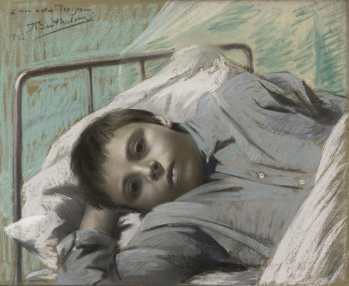
This portrait should dispel any misgivings that you have about pastels as a legitimate medium for portraiture. The depth of emotion captured in the eyes that stare out of the center of the image draw you in.
3. Union Square, San Francisco by William Larkins (ca. 1930)
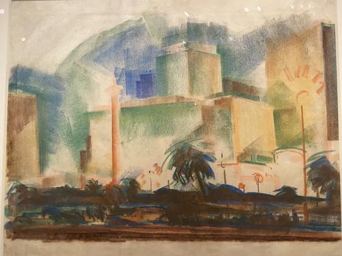
The artist used the long side of the pastel chalk in a technique called sidestroke to quickly fill in the blocks of color that make up the tall buildings in the city square. Combined with an unusually thin paper choice, this piece showcases the gestural fluidity and energetic immediacy that is unique to pastel art.
4. Central Park #1 and #2 by Joseph DiGiorgio (1984)
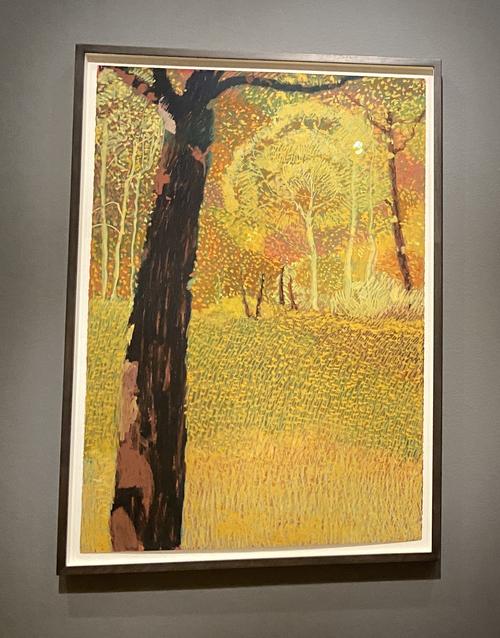
Other than the introduction of the color green, the only other major change to the medium over the years came during the twentieth century. Advances in petroleum technology made it possible to create oil pastels. This added new depth of color, the ability to add up layers, and opportunities for different techniques such as “scratching.” DiGiorgio’s paintings are excellent examples of these features and techniques.
5. Dateline: (08-07) 16:22 PDT Trona, CA (AP) by Donna Anderson Kam (2020)
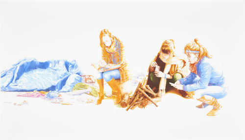
There’s no mistaking that this is a contemporary piece of art, since the artist has depicted one of the people in the photo wearing a mask and another gazing at the screen of a cell phone. It’s a portrait of three young people in a homeless encampment. The image is rich in color, has impressive detail in the texture of clothing and hair, and shows off what artists are doing with pastels today.
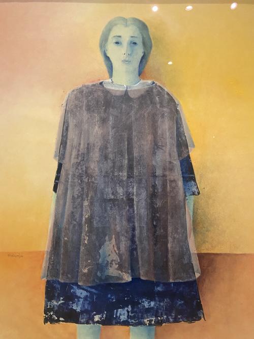
Honestly, we could easily list another dozen must-see artworks in the exhibit. There’s a Salvador Dali piece that you won’t believe is worked in pastel. Morris Broderson’s eerie Lizzie Borden (1966), shown above, boldly combines pastel and watercolor. Rupert Garcia’s Calavera Cristobal (1990) cuts directly to the power of line, with a skeleton superimposed over a sketch of Christopher Columbus. Claudio Bravo’s Mystic Package (1967) looks so realistic that you want to reach into the frame and untie the twine to find out what’s inside. And, of course, Wayne Thiebaud’s Pastel Scatter, which is a pastel artwork depicting pastel chalks, is a quintessential piece for this exhibit.
“Color into Line: Pastels from the Renaissance to the Present” is showing at Legion of Honor through February 13, 2022.

Sr. Contributor
Comments (2)

I love that things are opening back up again! Seeing this next week~
Thank you!! ❤️