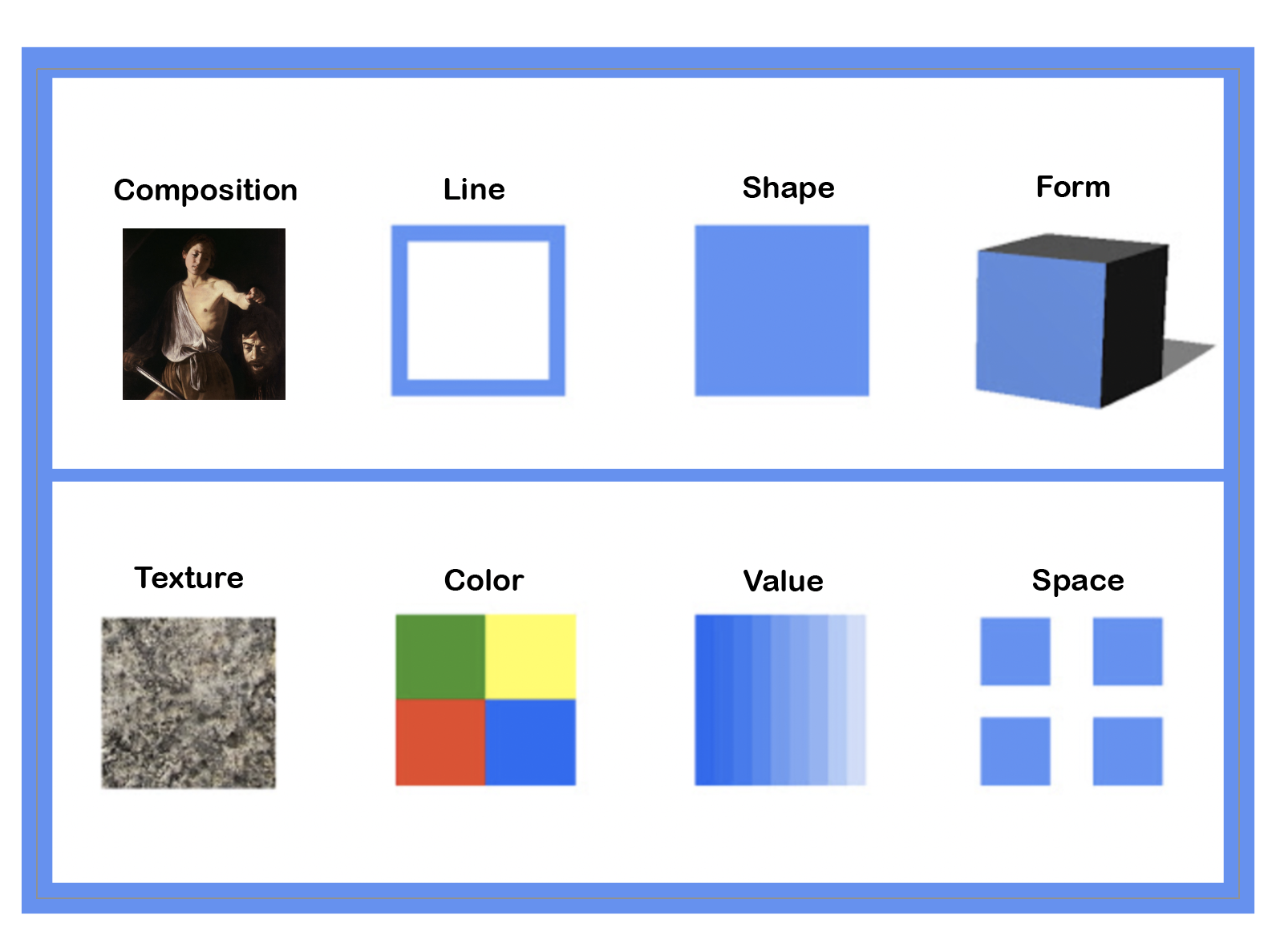
One way to look at all art is through the lens of design. All art uses the same basic elements of design, but combined in creative and infinitely varied ways. Depending on who you ask there are any number of key elements of design. We think these are the most important eight:
-
Line
The line is the most basic element of design. Individual lines can obviously be straight or curved, thin or thick, regular or irregular, solid or dotted, continuous or discontinuous, explicit or implied, or a million combinations of the above. Lines can create energy and direct the eye around a work of art. Notable artworks that demonstrate the importance of line as a key element of design include:
-
Albrecht Durer’s woodcut The Four Horsemen of the Apocalypse
-
Egon Shiele’s Seated Woman With Bent Knee
-
Color
Color has a rich history all on its own as well as all kinds of uses and meanings. The Aboriginals in Australia would travel thousands of miles to acquire yellow ochre for ceremonies and art-making, trade with other tribes, and, the ultimate team-building exercise, long-distance traveling with your mates. Color, as obvious as it may seem to us in the modern world, has a complex story to tell across time, from the cave paintings of Europe to the tribal art of Australia. Color is more than color, it's connected to precious natural resources, chemistry, trade, wealth, etc.
Color theory as we understand it today was largely pioneered by Sir Isaac Newton, who put together the first color wheel to describe the relationships between colors. For example, colors that are next to each other on the wheel are called analogous, and colors that are across from each other are called complementary. Analogous colors create a sense of harmony, whereas complementary colors create contrast, making each other “pop.” Artists use color relationships in order to create the mood and energy they seek to portray. The Post-Impressionists and Fauvists used color expressively, a trend that continued into the twentieth century with Abstract artists like Kandinsky, who believed that colors had intrinsic spiritual meanings.
-
Ellsworth Kelly Blue Green and Red
-
Georgia O’Keefe Cow’s Skull: Red, White, and Blue
-
Mark Rothko Dark Over Light Earth Violet and Yellow in Rose
-
Vincent van Gogh Edge of a Wheat Field with Poppies
-
Composition
Composition is how an artwork is organized. In photography, they use the term rule of thirds. This is a compositional device that divides space into thirds. If you weight a subject or an object on one of these lines or near it, you create a composition. There are many compositional devices such as the rule of thirds, one famous one, is the X and the S composition, Rubens was a master at both of these compositional styles.
-
Peter Paul Rubens Raising of the Cross
-
Johannes Vermeer The Astronomer
-
Space
Space can be expressed in multiple ways. There can be the illusion of space using one point or multiple point perspective or actual space, the space an object or artwork lives in or the actual space itself. Space can be shallow or deep. It depends on the artwork. Renaissance relief sculptures used shallow space physically, however they depicted a sense of deep space using one-point perspective. Space is also actual space, the space in the natural world. Art objects live in space of course, but some artists like Robert Smithson use the natural world and the surrounding space as an integral part of their art.
-
Sol de Wit 12x23x12
-
Donatello Madonna of the Clouds
-
Form
Form is the shape an art object takes by itself. Sculpture is a great example, it exists in space as a form, that has a scale in three dimensions. You can literally see its form; sometimes even walk around the form in space. Of course, two-dimensional works have form, but we engage with that form in a different way. Form and function is a term that gets thrown around a lot and for good reason. Artists have been considering form since the time of the cave paintings and Engineers and Scientists have to consider form as well. Some artists consider their form before they start and others let the form take shape as they work. Brancusi was a master at combining forms, he would stack multiple forms on top of each other creating one unique form out of many forms. Others like Rodin would create form by creating molds out of plaster then casting it in bronze or sometimes just leaving it in plaster. If you ever visit the Musee D’Orsay you can see his large plaster Gates of Hell in person.
-
Constantin Brancusi The Sleeping Muse
-
Auguste Rodin The Kiss
-
Michelangelo Pieta
-
Shape
Shape can be easily overlooked. It is the basic shape that an artwork takes or uses in its composition. For example, the Mona Lisa is a rectangle. This is important because it tells us she is not a circle or a square. As silly as this sounds, it's very important to be accurate about such things. Sometimes the shape connects an artwork to its meaning or its connection to its time. For example, Sol Lewitt uses the shape of a square to explore how many different ways you can explore a square or a cube. Another good example is Ellsworth Kelly’s use of shapes to express his minimalist color fieldwork both for the actual shape of the artwork but also as the subject matter.
-
Louise Bourgeois Maman
-
Piet Mondrian Composition with Color Fields
-
Picasso Violin
-
Texture
Smooth or Rough texture cannot be escaped. Everything has texture. Artworks are no exception. Texture is either a by-product of the medium that an artist chooses or it can be intentional. The world likes to wax blissfully about how the impressionist artist showed their brush strokes intentionally, and we all love how radical that is/was. Texture can add meaning to a work of art, but sometimes it's just a byproduct of being a material in the world.
-
Anselm Keifer Let a Thousand Flowers Bloom
-
Berthe Morisot Eugene Manet on the isle of Wight
-
Meret Oppenheim Object
-
Value
A great way to think of value is this: imagine 0 being white and 10 being completely black. All the numbers in between 0 and 10 are grays that build to black. This is called a value scale. It is used in many aspects of art and art-making. Photographers use a grayscale in the darkroom to evaluate values for their prints. Drawers need to understand how to create values to make a contrast in their drawings. You get the idea. Color has value as well and it can be described in a value scale. There is a famous story that during the invention of cataract surgery patients who had been blind, but cured by having their cataract removed exclaimed: “what are all those black spots!” Turns out they were seeing shadows (aka black) for the first time and it was overwhelming them visually.
-
James McNeill Whistler Nocturne in Black and Gold - the Falling Rocket
-
Rembrandt van Rijn The Storm on the Sea of Galilee
This reader is part of a larger series of introductory texts about art and art history. Each has been written under the direction of Rick Love. This reader was co-authored by Francisco Serrador.

Director of Education
Comments (6)

Well this is always a good thing when you can read about design.

Thanks for the interesting blog! I have been studying design for a long time and I am always eager to learn something new. Design elements are the basis of everything, so every designer should know this information.
Fascinating
I love to check out latest on art theory
Wish this went a little deeper...