Ellsworth Kelly thought the notion of art being entirely self-contained in it’s frame was “a hangover from the Renaissance.”
It’s pretty common now for art to be tailored specifically to its intended space, but Kelly was among the first to pursue this method. His interest in how art could interact with architecture began when he visited a museum in Paris and found himself more inspired by the windows than the paintings. Robert Smithson would be another example of an artist who explored site-specific artwork, but his approach was far less flexible, as in works such as Partially Buried Woodshed. When you have to have twenty truckloads of dirt thrown over your piece to complete it, it really can’t be moved.
Colors Panels for a Large Wall was originally created for the lobby of the Central Trust Company in Cincinnati. In a newspaper clipping of its unveiling, it's described as a six figure painting accenting the $35 million tower. While there, it was configured as two rows of nine panels and the placement of each individual panel was based on chance.
Cut to 1992, and the piece found itself homeless. It was given to the Cincinnati Art Museum, but they couldn’t find a suitable spot for it. Understandable considering it is Kelly’s largest work. Kelly’s husband Jack Shear said they even played with the idea of constructing a building for the piece after they traded the Cincinnati Art Museum two paintings to get it back.
When Shear was on a visit to the National Gallery, he struck up a conversation with the curator who asked if Kelly might consider doing a piece for a large wall that at the time only featured a work by Joan Miró. Boom, new home found. The Miró was moved and Kelly reworked Colors Panels for a Large Wall into three rows of six panels to fit its new setting.
Kelly’s flexible approach definitely worked out for him. Unlike Tilted Arc, Color Panels for a Large Wall didn’t have to be destroyed to find a new home. As an added bonus, Kelly has said he prefers the new grid configuration of it’s second installation.
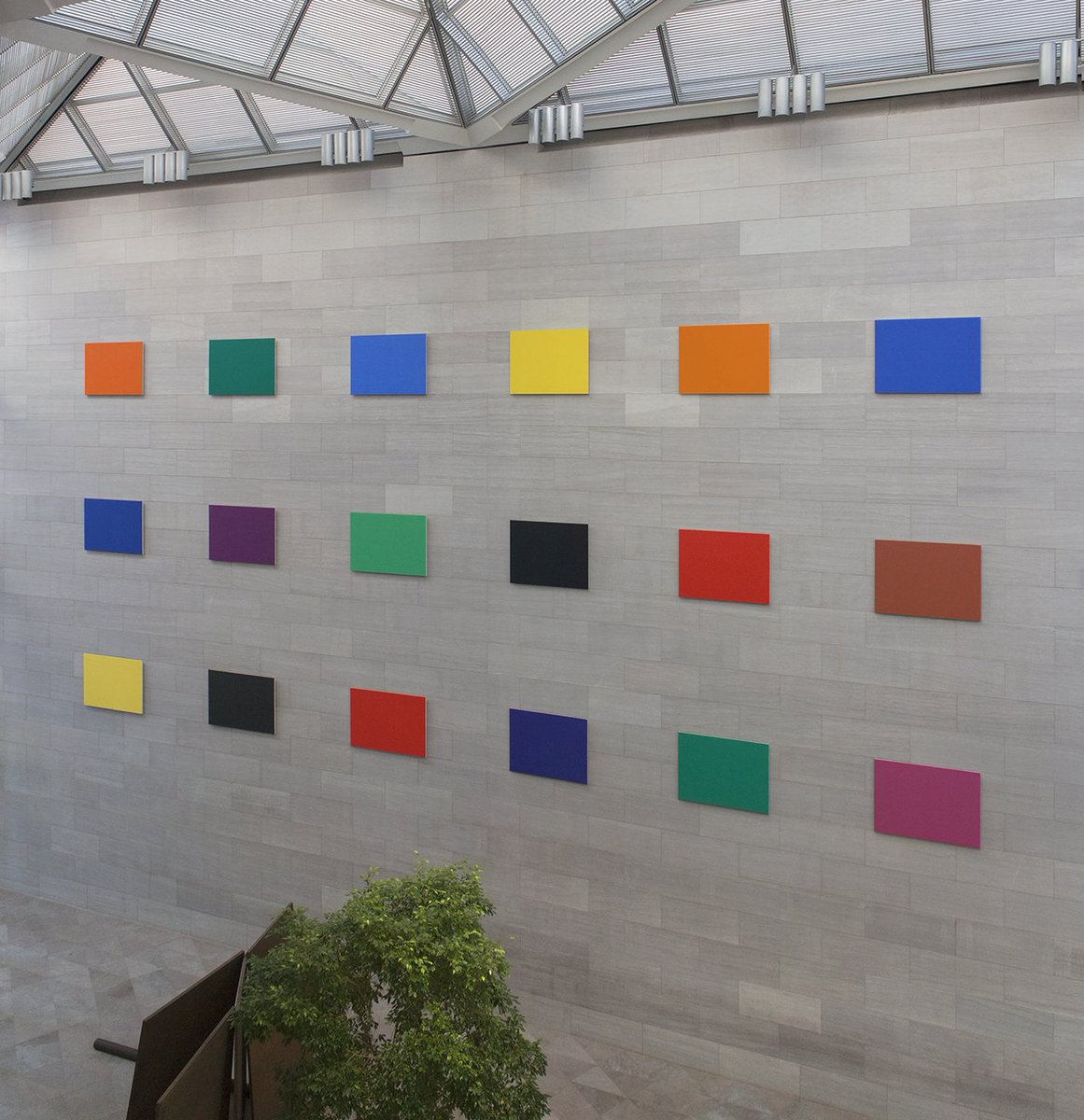
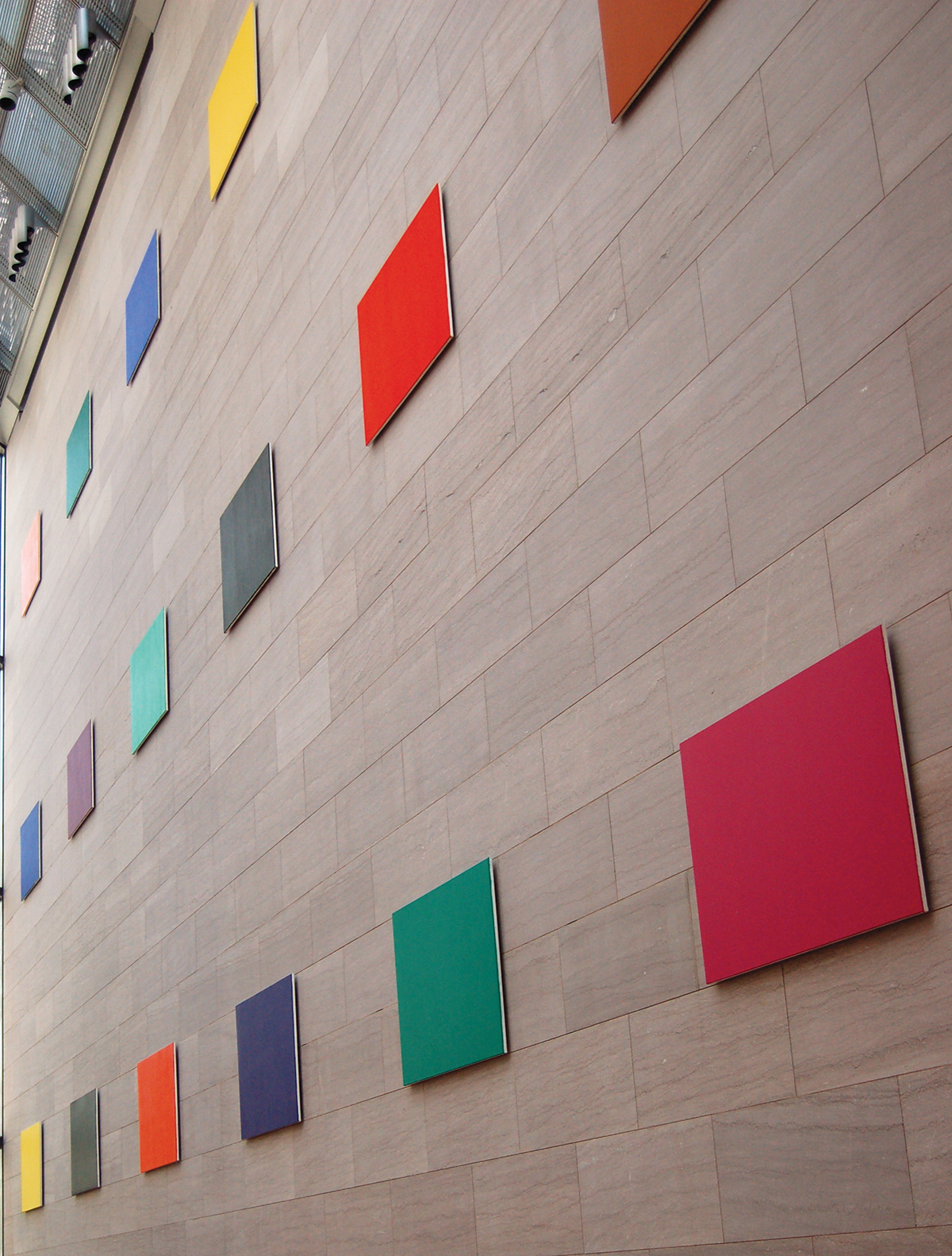


To be completely honest, I used to look at these artworks by Ellsworth Kelly and be annoyed with how easy they would be to paint. However, I have much more respect for them now. Kelly is such an expert on using color here. I like this artwork because the colors all go together so well; it is very eye-appealing and soothing in my opinion. I also like that this work was made for a specific place so that it fits with the architecture and background. It is cool that he worked with the gray texture of the wall instead of ignoring it. Since this artwork was made for a specific location, I think the perspective is much more important. I am not truly getting the experience of the artwork by only seeing a photo of it. The correct perspective would be standing in front of it in Washington DC.