Georges Seurat's Le Pont de Courbevoie, or The Bridge at Courbevoie, was discovered by a writer and collector named Paul Signac to be a member of a trio of paintings, along with Seurat's more famous La Grande Jatte and The Seine at Courbevoie.
The artist composed the three works within a small distance of the banks of the Seine. Michelle Foa reveals that "by creating a trio of figure paintings, Seurat rejects the autonomy of meaning of the individual tableau. Instead, he disperses the meaning of his works across the group and thereby indicates that we can only fully understand each picture via its relationship to others in his oeuvre." Additionally, it is only possible to understand Seurat's pictures in relationship to the scientific and artistic oeuvres he studied and those which he would influence. In his youth, Seurat studied closely the way Delacroix used color, and combined it with a number of contemporary scientific theories of optics to derive his theory of color and ultra-rational approach to painting, the two aspects of which were dubbed "pointillism," which refers to the pixelated quality of his works, and "divisionism," which describes his controversial theory of the division of color in order to achieve the maximum emotional effect. In turn, the hyper-rational, methodical, almost machinic approach of Seurat would be a primary influence on the perspectives of Picasso, Braque and the other cubists. Le Pont de Courbevoie directly influenced the work of Bridget Riley, who made a study of it.
Aviva Burnstock of the Courtald Institute, one of the world's leading art preservationists, co-authored a seminal article in the study of Seurat, focusing on the philosophical, scientific, experimental and technological development of his practice. While the article reinvigorates the memory of the painter as a thinker and, maybe at heart, a scientist, it also lends a little bit of credence to one of the main negative criticisms of Seurat: that his work lacked soul and spontaneity. His paintings look like computer graphics from the '90's, which could be either a good or a bad thing, depending on what you're looking for in art.
As a technologist, Seurat was brilliant, and he effortlessly formed his aesthetic sensibility into a theory of color that tried to get at the physiological basis of emotional life. "Art is Harmony," the artist declared as an introduction to his theory of the relationship between cacophony and harmony. "Harmony is the analogy of the contrary and of similar elements of tone, of colour and of line." It is possible to think of tone, color, and even line in music, so Seurat's theory holds up pretty well, so far. But, ever the specialist, he does not maintain this breadth of vision after this sentence, narrowing into his analysis of painting: "In tone, lighter against darker. In colour, the complementary, red-green, orange-blue, yellow-violet. In line, those that form a right-angle. The frame is in a harmony that opposes those of the tones, colours and lines of the picture, these aspects are considered according to their dominance and under the influence of light, in gay, calm or sad combinations."
It is rare to find such a comprehensive, color-by-numbers prescription to "correct" painting from an artist, but Seurat's philosophy of painting is just as famous as his works themselves, and the two endeavors are the essence of his biography.
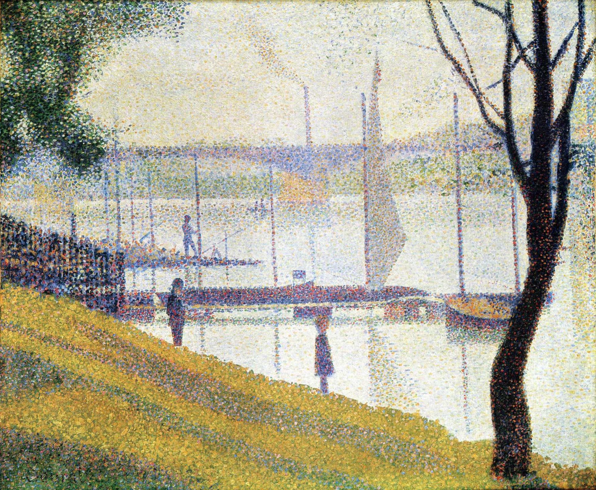

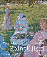


Right away, I found the picture to be interesting due to the nature of how it was made. I really enjoy the creativity of using dots to create the picture within. The shades of the different colors within this picture help bring it to life.