
More about Annie, Poured from Maple Syrup

Contributor
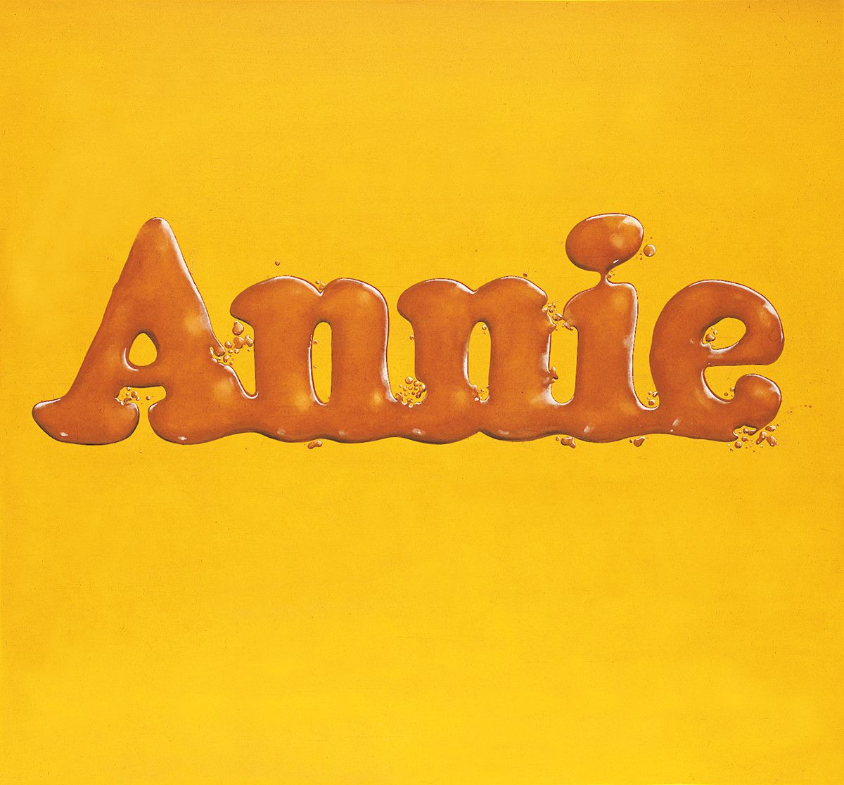
They told us not to play with our food as kids, but here’s Ed Ruscha doing just that with Annie, Poured From Maple Syrup, and the dude got put in museums.
That’s only half true, though. No matter what your eyes are telling you, you’re actually not looking at syrup poured out in the form of a name onto a yellow surface. Well, you are. But it’s not real syrup that you can, you know, eat. So even though your mouth is watering, let’s break down some of the cool things Ed Ruscha did to make this painting as provoking as it is. I promise you can get some breakfast after this.
Annie, Poured From Maple Syrup splattered onto the scene in 1966, in the heart of the Pop Art movement. It had been a whole four years since Andy Warhol’s Campbell’s Soup Cans set the tone of the movement. Pop Art was such a divergent shift in the art world at the time. Instead of paintings exploring deep themes through history or mythology, Pop Art uplifted relatable everyday items to get their message across while simultaneously resonating with the common person. It was a way to use recognizable surface level things to tell a deeper story.
Understandably, when something as groundbreaking as Pop Art emerges, everyone’s gotta try their hand at it. But when everyone is flocking toward something, it can be hard to stand out. Ruscha was a photographer, conceptual artist, and a painter in his own right, and with Annie, Poured From Maple Syrup, he was able to contribute to the movement while maintaining a level of individuality. He did that by using Trompe l’oeil, which is French for ‘deceives the eye’. A lot of work coming out of the Pop Art movement re-used commercial images and put them through filters, or made collages out of them. But Ruscha took the concept of Pop Art and meshed it with another craft altogether. Talk about a power flex.
Something as seemingly thematically simple as this painting can have viewers scratching their heads as to what it all means. Well, the font used in the painting is the same font used for the little orphan Annie comic strip that was popular in America at the time. It predates the popular Broadway musical you’re probably thinking of.
But the title is written in syrup. So is this a painting about Annie, or about breakfast? Well, maybe it’s both. It could be an abstract representation of reading the funny pages during breakfast. A blending of foggy memories during the groggy hours of the morning. Or it could mean nothing. Maybe it’s just a combination of familiar images that evoke similar reactions from people. Maybe it simply exists to convey familiarity upon its audience. And if that’s the case, at the very least, it enables us to feel seen.
Sources
Sources
- Brittanica. “Trompe l’oeil”. Accessed May 28, 2019. https://www.britannica.com/art/trompe-loeil
- First We Feast. “The Most Iconic Food Paintings”. April 7, 2015. https://firstwefeast.com/drink/2015/04/iconic-food-paintings/annie-pour…
- Jones, Jonathan. “Ruscha’s Annie, Poured from Maple Syrup is a modern masterpiece”. The Guardian. November 28, 2011. https://www.theguardian.com/artanddesign/jonathanjonesblog/2011/nov/28/…
- The Art Story. “Pop Art”. Accessed May 28, 2019. https://www.theartstory.org/movement-pop-art.htm