

More about Red Room
- All
- Info
- Shop


Contributor
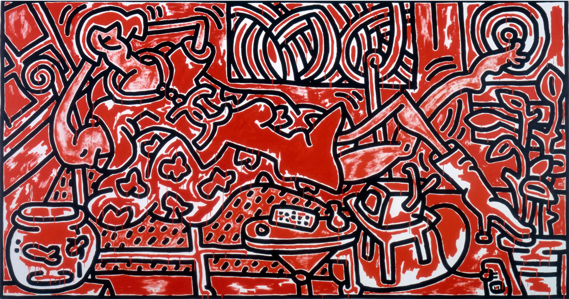
Good luck getting a sense of Keith Haring’s Red Room (1988) on first glance.
With its energetic line work and intense black, white, and red color scheme, this painting evades fast identification. Perhaps the colors - a classic Haring trio - are at first reminiscent of Stephen King’s "The Shining" (REDRUM, anyone?). Look again and the painting has a jazzy feel - a person lounging, surrounded by bold lines and patterns that give the gigantic painting a sense of life and urgency. These two opposite impressions seem irreconcilable at first, and yet, in the context of Haring’s work, the question arises: why not? Why can’t the piece have a little haunted hotel and jazz relaxation simultaneously? The near-hysteria of the work invites such dichotomies to coexist. The fact that Haring was also a fine artist and a graffiti artist - two opposite sides of the “establishment” - also must mean that we can have opposite gut reactions too.
This painting is often compared to Henri Matisse’s Red Room, made 80 years earlier. The titular red room and central female figure make this comparison obvious, right? Well, upon closer inspection, the figure in Haring’s piece becomes ambiguous: the right arm seems muscular in a distinctly male way, and yet the left mid-torso seems to feature a round breast; the right foot is large and bare, while the left leg features a stiletto boot. The figure also wears a large Coco-Chanel logo on their necklace: is this a nod to ‘80s hip-hop bling, or a feminine decoration? Once again: why not both? Chanel’s female clothing line has often, in fact, been inspired by men’s wear. This piece could be seen as Haring breaking down gender roles at a time when the gay community was being hit with the AIDS crisis. In fact, in 1988 - the year the artist made this piece - Haring was diagnosed with AIDS himself. Yet, instead of wallowing he turned to his signature, primary color palette and fast, bold line work to celebrate the brilliance and vivacity of life. Opposites, indeed.
Though this painting doesn’t have the public recognition of Haring’s more minimalist dancing figures or dogs (i.e. hipsters don’t go around wearing this work on their t-shirts or ball caps), it encapsulates the frantic, joyful, sometimes-confusing energy of Haring’s work. Using a bold color, the artist has made a monumental scene out of a classic art history motif: the good ol’ lady on a chaise lounge. Yet he has put some life into it: modernizing it with his graphic brushstrokes, and blowing it up to an epic eight by fifteen feet. This mural-like painting now hangs at The Broad, where it playfully transports viewers into another space. Forgive me if for me that space is The Stanley Hotel, awaiting an axe to come through the door…
Sources
Sources
- Gehring, Ulrike. “Disegno e Colore: The Reconciliation of Two Rivals in the Art of Keith Haring.” The Keith Haring Foundation, accessed May 10, 2019, http://www.haring.com/!/selected_writing/disegno-e-colore-the-reconcili…
- “Hip Hop Jewelry.” hiphopbling.com, accessed May 10, 2019, https://www.hiphopbling.com/pages/hip-hop-jewelry.
- “Keith Haring.” The Art Story, accessed May 10, 2019, https://www.theartstory.org/artist-haring-keith-artworks.htm.
- “Keith Haring.” The Broad, accessed May 10, 2019, https://www.thebroad.org/art/keith-haring.
- “Keith Haring: The Red Room - 1988.” ArtUniversal Blog, accessed May 10, 2019, https://artuniversalblog.wordpress.com/2017/05/04/keith-haring-the-red-….
- “Red Room.” The Broad, accessed May 8, 2019, https://www.thebroad.org/art/keith-haring/red-room.
- Whitehead, Jennifer. “The Chanel Logo,” accessed May 10, 2019, https://medium.com/fgd1-the-archive/the-chanel-logo-50ce0b30f09a.