Comments (2)

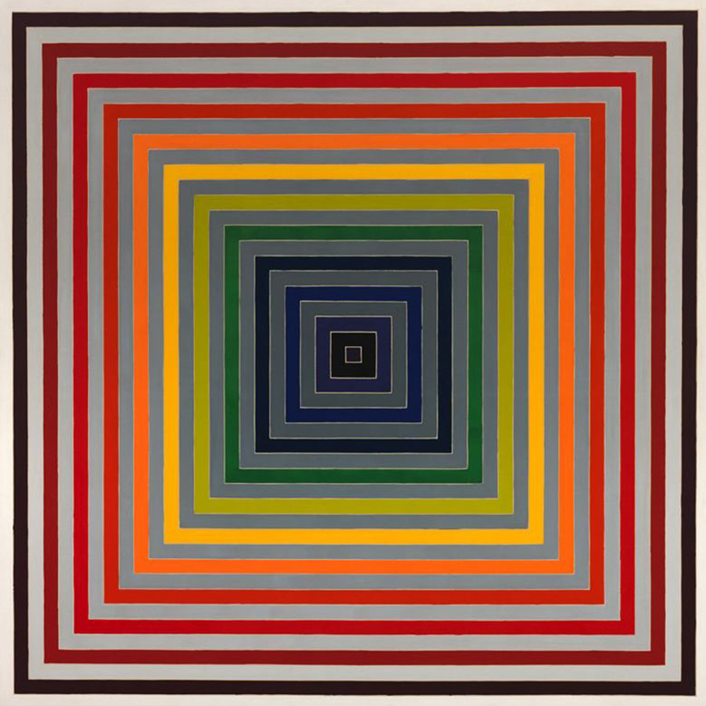
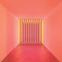
This is such an interesting piece. Every time I look at it, a different thing is emphasized. The longer I look at it, the emphasis shifts. This piece appears to use atmospheric perspective, in which the brightest colors appear closest. This gives the piece visual depth. However, the brightest colors are in the middle of the order of the lines, which keeps the eye from naturally making a pyramid shape. I find it difficult to keep the brightest lines "closest" in my mind the longer I observe the piece. My mind wants to make some form of a pyramid, whether that be inverted with the point going away from me or normal with the point coming out towards me. But as I continue to look the piece begins to appear shallower, and eventually even flat because it cannot easily see the shape it wants to. I do think it is an interesting and beautiful piece.

I like this job. I am interested in art and sometimes I paint pictures, now this is my hobby. I am currently studying at a medical college and in order to have more time for my hobby, I use the services of https://nursingwriting.org/ ,thanks to which I can order written work on any topic