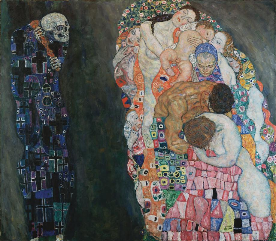
Gustav Klimt, Death and Life, 1908, Leopold Museum.
In any fictional crime show, the detective walks into a scene full of chaos. Instead of being overwhelmed, the detective investigates and catches specific small details to discover what occurred. Generally speaking, they are creating order and organization out of specific elements amongst the disordered scene using Gestalt principles, just like artists and designers do. The Gestalt is based in the mind rather than simply what is physically in front of us. Art viewers and critics are just detectives for works of art, which can sometimes be more absurd (or even derivative) than a crime scene.
The Germans have long influenced the way we view art. From dark Gothic architecture and reproduction using the printing press, to the functionality of the Bauhaus and concrete designs of Brutalism, German art reigns. The modern discipline of art history and theory is built on the thoughts of German philosophers and theorists, like Johann Joachim Winckelmann’s development of aesthetics and Heinrich Wölfflin’s understanding of formal analysis. Gestalt theory similarly originated in Germany. Within art theory, the practice that explains how we think about art and its functions, the psychology of the Gestalt helps us understand how our brain interprets art.
Focusing primarily on composition, the term gestalt is a German word meaning “unified whole.” In the 1920s, while Sigmund Freud was psychoanalyzing our deep desires, German psychologists Max Wetheimer, Kurt Koffka, and Wolfegang Kohler were developing Gestalt psychology. The group wanted to better understand how our brain interprets the visual chaos of our world. The principles they developed explained how we visualize specific elements of our world, and how our minds find order and organization. This is a step further than the elements or principles of art and design. Design industries have long used these rules to create unique and creative designs. These usually are seen as a whole, an intriguing eye-catching logo, while the visual detective will see the references to the concept, product, or use. Below are examples of the Gestalt principles in use. Put on your art detective hat, and see if you can spot the Gestalt principles used.
Closure:
With closure, our minds like to see complete lines, shapes, and forms in front of us. When an artist uses gaps in their lines, whether intentional, due to a stiff paint brush, or unintentional, with a pen that runs out of ink, our mind closes those gaps to read the shape as a complete object. This can often be seen with the use of contrast; the use of a dark shape against a light shape can create an implied line or shape that we see as whole. In Mary Cassatt’s The Coiffure, the edges of the woman’s dress are not drawn in harsh outline, but the contrast of the background against the white fabric creates closure. Jean Metzinger’s La Danse, Bacchante uses a pixelated approach to the figure; each square is a specific hue having space between each. However, when viewed from a distance, the line and form of the figure are closed.
Common Region:
Our brain also likes to group specific elements together to relate them within a closed area. This occurs within shape and color most often; elements within a specific colored background will be seen as being related. In Frederic Remington’s The Mier Expedition: The Drawing of the Black Bean, we see common regions being used in the narrative based on the placement of people within the composition as well as the colors of their clothing. We will visually group together those on the right with the lighter colored clothing as one group and those on the left with the tan clothing as a separate group. Within landscapes, Marsden Hartley uses common ground in The Summer Camp, Blue Mountain. This style is beginning to veer into abstraction and stippling. As the dark, cool colors of the mountain group the individual strokes together in the background, the green and red paint strokes are separated and grouped together in the foreground.
- The Mier Expedition: The Drawing of the Black Bean by Frederic Remington
- The Summer Camp, Blue Mountain by Marsden Hartley
Figure/Ground:
The use of the figure/ground theory is one of the most ubiquitous of composition tools. Essentially, usually using contrast, we see the foreground and typically the subject of the image first and then the background. Sometimes artists will play with the ambiguity of the images, making the viewer work to see what is being shown. The use of contrast and color theory usually helps the viewer complete the composition. Kerry James Marshall’s expert use of color uses the figure/ground relationship in Untitled (Studio). The dark toned skin of the figures draw the viewer’s attention, creating strong contrast against the bright colored background or ground. Similarly in Jupiter and Io by Antonio da Correggio, the figure draws immediate attention due to its pale skin against the dark ground of the clouds.
Proximity:
With proximity, our mind perceives elements that are closer together as related and elements farther apart as unrelated. We will often see shapes grouped close together as one unit separate from anything else in the composition. Gustav Klimt’s Death and Life uses proximity through contrast and color to create a relationship between the figures. Those on the right are very close together, showing a relationship between them, representing life. The figure of death seems to be moving towards the others but still stands solitary and separate. Harriet Powers’s Pictorial Quilt uses proximity within separate quilt squares. Each square has its own event and action, showing relation through the closeness and presence within the shape.
Common Fate:
Common fate shows a relationship between elements that are moving in the same direction to be seen as one unit or a collective. This is easy to view in Cai Guo Qiang’s Cry Dragon/Cry Wolf: The Ark of Genghis Khan, where the forms in the installation are close and moving in one motion, a reference to Asian expansionism. Pieter Bruegel the Elder’s The Blind Leading the Blind uses movement to create common fate. The figures each rely on the other to get where they are going, but when one falls, the rest will soon follow.
- Cry Dragon/Cry Wolf: The Ark of Genghis Khan by Cai Guo-Qiang
- The Blind Leading the Blind by Pieter Brueghel the Elder
Continuation:
Similar to closure, our mind views patterns and is able to see them continue off the page. This can be seen in Classic Landscape by Charles Sheeler, where the railroad is the primary movement that creates a diagonal line for the viewer to move throughout the work. While we do not see the beginning or end of the railroad, our mind assumes the pattern continues off of the canvas. This can be seen in Suzuki Kiitsu’s Morning Glories as well, where the pattern of the plant comes down from the top of the composition. While the top of the composition cuts through the plants, and since the pattern continues throughout, we can assume the plant growth continues above the composition.
Similarity:
Similar (pun intended) to Common Region, similarity groups comparable elements together depending on their closeness, color, brightness, size, and more. This takes the idea of closeness a step further by considering the overall look of the elements, rather than simply their placement in the composition. Francois Boucher’s The Birth of Venus uses similarity in the color, light, contrast, and closeness of the figures and shapes. The top two-thirds of the composition use lighter colors with peach tones and a closeness of the figures to show a relationship between the figures. The action on the lowest third of the composition uses stronger contrast, slightly darker colors with tan and brown tones, and again, closeness between the figures. In Sandro Botticelli’s Primavera, there is a similarity in the figures’ clothing, poses, and colors. The proximity and similarity of the figures show a relationship between them, celebrating the coming of Spring.
Symmetry:
Symmetrical elements are viewed together as a whole, despite any distance. Our mind likes things organized, balanced, and the more symmetrical the better. In art, it is rare for a work to be completely identical on both sides, but many artists use this to achieve similarity between the two halves. Frida Kahlo uses symmetry in Self Portrait with Thorn Necklace and Hummingbird. Aside from her expert use of symbolism, her figure is centered with the plants, animals, insects, and thorns adorning her in an almost even way. Philipp Otto Runge uses symmetry, almost exactly, in The Morning. The frame breaks up the work between the action and border, bringing our eye back into the primary focus. On either side of the central figure, the angel figures, scenery, and plants create full symmetry. Vincent Van Gogh’s Bulb Fields finds symmetry within the landscape, almost completely symmetrical aside from the colors of the flowers, shapes of the tree and houses, and the person traversing the field.
- Self Portrait with Thorn Necklace and Hummingbird by Frida Kahlo
- The Morning by Philipp Otto Runge
- Bulb Fields by Vincent van Gogh
Conclusion:
When we analyze any work of art, we usually start with the essential elements and principles. Now that we are official Gestalt experts, we can add the above principles to the list. Now it’s time to immerse yourself in the role of artist detective and see if you can find the Gestalt principles at work in the following works of art:
- Forbidden Fruit Picker by Wangechi Mutu
- 1. The Arrival by David Hockney
- Gas by Edward Hopper
- Woman on a Bridge #1 of 5: Tar Beach by Faith Ringgold
- 727 by Takashi Murakami
- Freedom from Want by Norman Rockwell
- Bird in Hand by Ellen Gallagher
- Carnival in Flanders by James Ensor
- African't by Kara Walker
- Armida Encounters the Sleeping Rinaldo by Giovanni Battista Tiepolo

Adjunct Instructor, Forsyth Technical Community College
Comments (3)

Informative Post! Thank you for explaining the Gestalt Theory with Art History Reader.

Apparently, in medicine, Gestalt is sometimes used in addition to objective scores, and has sometimes been found to actually work better than objective scores. In other words an assessment by a physician based on their experience and taking into account all of the observed symptoms and circumstances can be a superior way of diagnosing a patient to relying on a set of objective tests. Google 'gestalt and pulmonary embolisms'
Hopefully in the future you will publish many new articles, I will always support and accept the great things you share