More about Spectrum I

Contributor
Before the rainbow had associations with gay culture, Ellsworth Kelly was the first to immortalize It.
Way-back-when, before a rainbow was synonymous with gay and queer culture, Ellsworth Kelly painted one. And, yeah, sure, he had a husband for 32 years, but that has nothing to do with the iconic Minimalist painting titled Spectrum I (1953).
In the late 1940s and early 1950s, the world was on the struggle bus headed in so many different directions. Picking up the pieces of the Second World War, Abstract Expressionism was the name of the art game. Contemporary artists had completely foregone any visual presentation of form or function and started capturing pure emotion on canvas. Pollock, Rothko, de Kooning and their lesser known female contemporaries Jay DeFeo and Joan Mitchell (among many other less known female AbExers) dominated this era with bold swooping gestures, drippy erratic canvases and color fields bleeding in and out of one another. The work of Ellsworth Kelly intellectually fits into this trope, but visually sticks out like a sore thumb with its hard edges and flat color.
Considered the “Last European Modernist," there is a sophistication around (the very American) Kelly’s work that was intentionally absent in the work of his contemporaries. An observant quality which is fine tuned and almost compulsively considered in each painting. Spectrum I and others works of this era, are less about emotion. Not that Kelly didn’t care about how the paintings made the viewer feel, maybe he did maybe he didn’t, but this work is about the way colors interact. “I wanted something with less personality for people to look at and not find a lot… if I didn’t have those years in France, I don’t know what I could have done.”
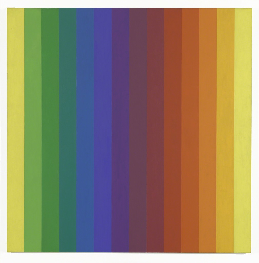
Spectrum I is a large, square painting with a series of 14 stripes in varying tones transitioning through the color spectrum with a hard-edged twist. It starts with yellow and seamlessly flows into each consecutive color until you find yourself back at yellow, presumably with a smile on your face because let’s be honest, if a rainbow doesn’t make you smile I’ve got questions for you. And then your eyes focus a little. Wait, what’s up with those lines? You now see that the work is actually a collection of 14 flat color panels. There is no gradient at all. Each color bar has a hard edge and the color has been carefully selected by the artist to not only give the illusion of gradient but so that each solid color interacts with those around it as well as the painting as a whole. The work is about how we perceive color, and no, those pulsations aren’t light trails from last night’s EDM frenzy, it’s just the brain trying to organize the information it’s receiving from the eyes. The result is a gorgeous rainbow canvas of undulating color and decades of “I could have done that”s and “yeah, but you didn’t”s.
Part Minimalist, part Colorist, part sculptor, this work isn’t about feeling, it’s about how color works, how it interacts with itself, and how even the most simple things become complex if given enough time. Haven’t you ever looked at the spelling of a word long enough that it looks absurd? Just like that, only in this case it’s a rainbow.
Sources
Sources
- Hurowitz, Richard. “Ellsworth Kelly, the Last Modernist,” The Octavian Report, Volume 2 Issue 1 (2016), https://octavianreport.com/article/richard-hurowitz/.
- Janson, Horst Woldemar and Anthony F. “History of Art: The Western Tradition,” Prentice Hall Professional. 2004.
- Schejldahl, Peter. “Studio Visit: Ellsworth Kelly,” The New Yorker, February 6, 2012. Accessed May 10, 2019. https://www.newyorker.com/magazine/2012/02/06/studio-visit.
- SFMoMA. “Ellsworth Kelly Abstraction,” San Francisco Museum of Modern Art. Video File. July 23, 2018. Accessed May 10, 2019. https://www.sfmoma.org/artist/Ellsworth_Kelly/.
- Spivey, Virginia B. “Art History since 1950 (Part I),” Art History Teaching Resources. Accessed May 10, 2019. http://arthistoryteachingresources.org/lessons/art-since-1950-part-i/.
Comments (2)