More about Fish Magic

  • All
  • Info
  • Shop

Contributor

Paul Klee’s Fish Magic looks like a scene out of some aquatic wonderland – mesmerizing multi-colored fish against a dark inky backdrop.

In a body of work that includes over nine thousand pieces, Fish Magic is Klee’s largest painting. But it isn’t the only thing that makes Fish Magic stand out from the rest. In fact, each of his paintings have a unique style and approach, from the minimalist lines of Why Does He Run? to the colorful blocks of Static-Dynamic Gradation. He dashed from style to style as seamlessly as a fish swims through water, going between, and combining, Expressionism, Cubism, Surrealism, and more. 

Beginning in 1921, Klee acted as a faculty member of the Bauhaus school for ten years, where he taught students about the importance of analyzing fish tanks. Yes, really. In his home, Klee had a large aquarium filled with multi-colored fish, and it was the task of his students to observe their movements. Klee believed compositions were all about movement, and he also lectured his students about the importance of studying nature for artmaking. His fish fascination was strong for a decade or so. In the 1920s, he created several fish-focused paintings, including Aquarium (1927), and Around the Fish (1926). 

While some of us may have a plastic castle and treasure chest in our fish tanks, Klee throws in symbols of clocks, clowns, flowers, and the moon. For Klee, the clock (the only object caught in a fishnet) stands as a symbol for controlling time, so that he would have more of it to dedicate to painting. Beside it sits a shining moon, showcasing Klee's frequent desire to evoke cosmic elements in his paintings. Klee also glued a small patch of muslin in the center of Fish Magic, making it a collage of mixed materials. 

Louise and Walter Arensberg donated Fish Magic to the Philadelphia Museum of Art. Before this, the painting hung in a guest bedroom in their Hollywood house, alongside Klee's Guest of a Landscape (1926), and Small Houses in the Garden City. When negotiating the relocation of their collection to the Philadelphia Museum, the Arensbergs were concerned about the proposed space for these works, writing: "We would like...a better setting for the Klees than the cribbed, cabined, and confined space to which you have allocated them," adding somewhat boastfully, " - in a room, by the way, which is scarcely more than one-half the size of our own bedroom."

Only a few years ago, as a push to bring art to young students, Fish Magic was reproduced and placed across several neighborhoods in Philly thanks to the Philadelphia Museum of Art’s Inside Out program. Once it went outside a Glenside Dunkin' Donuts, and then at a high school in Strawberry Mansion. 

Sources

Featured Content

Here is what Wikipedia says about Fish Magic

Fish Magic is a 1925 Surrealist painting by Swiss-German artist Paul Klee. The painting belonged to the collection of Walter and Louise Arensberg before being donated in 1950 to the Philadelphia Museum of Art where it is currently held.

Check out the full Wikipedia article about Fish Magic

Comments (3)

tinysushi

Looking at this painting makes me feel like there is a sense of mysterious and a bit spookiness to it. It feels like I'm looking at it through a fish tank and the items inside are the reflections. The shadows and colors that create these unknown depths and corners feel like they may just be swimming freely along with the drawn human figures. The painting does seem magical but there also appears to be something more than just magic, something that remains unknown.

Isaac

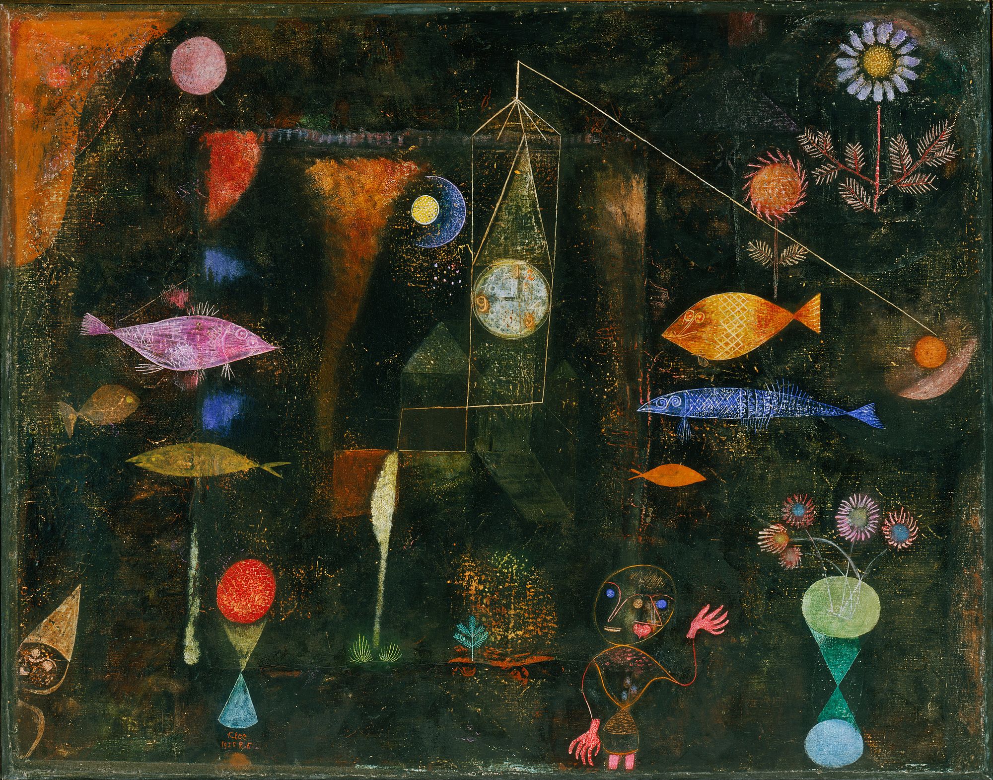
I think this painting is so fascinating. I was drawn to this painting because I used to actually have a weird fascination with fish. When I saw "Fish Magic" I knew I had to check out this painting. Putting my curser over the painting it said "Fish are friends, not food." I thought this was hilarious as I took this quote from Finding Nemo and used this as my fish motto. There are a few random objects in this painting, and my eyes kept just wandering around. I loved the dark background. This helped the painting pop out to me in the sense that the objects and the fish stood out to me more. Of course bright colors against a dark background would do that! The way the artist paints reminds me a bit of chalk. There are a few smears of color that look like chalk streaks as well as the fish.

Gracia

I really like this painting. It is not one I probably would have ever sought out because it is so random. I love the flowers throughout the painting. Simple daisies are my favorite flower and I think they were an excellent choice for this painting! The artist did a really good job with composition on this painting. I found my eyes never rested on one point because everything is spaced out just right. My eyes are constantly moving around to try to see all the components. I also really like the colors used. The bright colors against the contrast of the black create a cool effect and make the colors seem even more vibrant. I also like how the artist used some sort of smudging technique between the bright colors and the black to leave the color almost murky looking in some parts of the painting. This created a texture all of its own. I did not realize colors could create a texture!