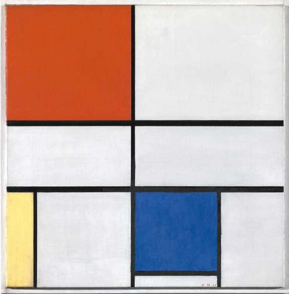


More about Composition C (No.III) with Red, Yellow and Blue
- All
- Info
- Shop

Sr. Editor
For such a simple Composition, Dutch artist Piet Mondrian had some lofty ideals about his geometric designs.
In his mind, the abstract cubes of bright blue, yellow and red and those thick black grids weren't just a pretty pattern. Starting out as a landscape artist, painting benign scenes of forests and mountains (snoozefest), Mondrian wanted to be able to get to the fundamental essence of nature.
He did this by whittling down his pretty pictures until they were the most basic lines and primary colors -- not even mixing paints to make different shades! And he wasn't just taking the easy way out. Here comes the hyperintellectual hippy-dippy part...
This guy believed that by eliminating any semblance of reality in his paintings, he was getting closer to the spiritual realm. Yep, he said basic colors and shapes are the truest form of nature, because pictures of trees and stuff get in the way of how nature makes us feel. Heady stuff, man.
Unfortunately for Mondrian, the philosophical aspect of his art has been forgotten by all but the biggest art snobs. Instead, we slap his metaphysical planes of color on designer dresses and stick 'em in a Katy Perry music video. Sorry Piet, guess America doesn't care about the spiritual truths of nature as much as celebrities and fashion...